Exploring CSS Grid
21 December 2017
I first heard about the CSS grid layout module from this presentation and was really mindblown! While learning CSS and building web pages, I’ve often been confused and annoyed by how complicated it is to lay out everything where I want it to be. (Flexbox, floats and clearfix, I’m looking at you!!)
Case in point from my internship web dev project, using Pure’s grids module:
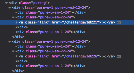
The two link lines are the only ones that have content inside; all those other divs are just there to provide different layouts for different screen sizes.
Wouldn’t it be great if content can just be content and css can take care of all positioning?

Apparently, with CSS grid, it can!
The main idea of CSS grid is that you can define a grid in CSS (surprise surprise) and slot in your content into specific grid cells. I decided to try it out on my website - its layout isn’t anywhere near complicated, but even then, when I first designed it, getting the layout correct and responsive took some experimentation.
Layouts
My website layout is pretty simple, with just one main content block. On small screens, the content block takes up the whole page width. On larger screens, the home page’s content block is thinner than on the other pages.
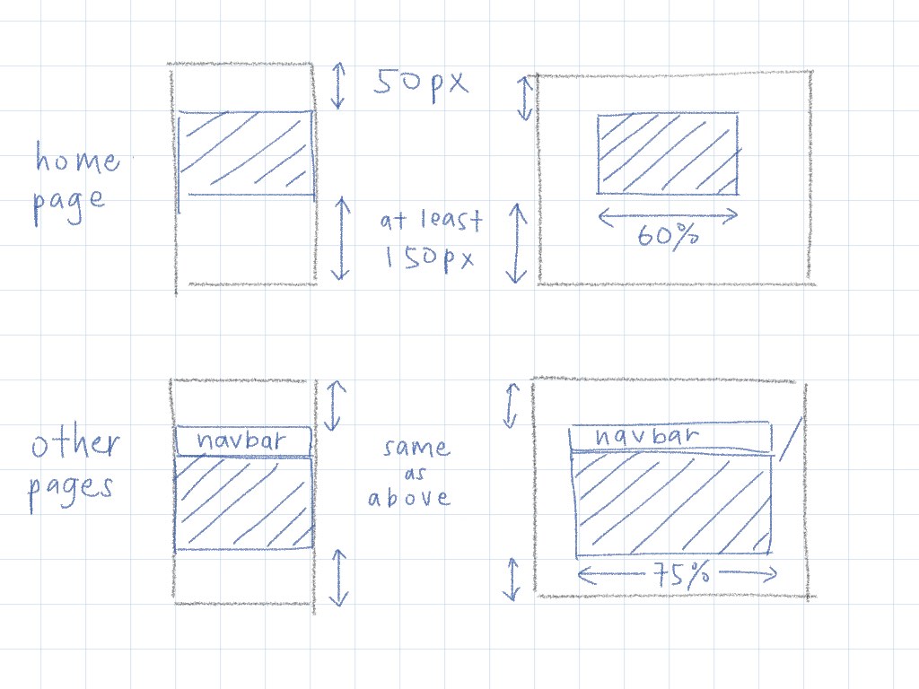
Initial implementation
Originally, I used a .wrapper class to add top and bottom margins, and .content-block for the main content blocks (the shaded area in the above sketches). I tried to put the layout stuff in .wrapper as far as possible, and just let .content-block have content. This worked ok for the normal pages:
  <div class="wrapper">
    <div class="navbar page">...</div>
    <div class="content-block">...</div>
  </div>
.wrapper {          /* designing for mobile-first */
  width: 100%;
  min-width: 400px;
  max-width: 960px;
  margin: 50px auto 150px;
}
@media (min-width: 36em) {
  .wrapper {        /* add space at the sides for bigger screens */
    width: 75%;
  }
}

.content-block {
  background: white;
  width: 100%;      /* fill the entire .wrapper block */
}

.navbar {
  width: 100%;      /* fill the entire .wrapper block */
}
The home page had the same wrapper, but no navbar and an additional .home class for the content-block.
  <div class="wrapper">
    <div class="content-block home">...</div>
  </div>
Addition to the css to make the content-block thinner on big screens:
@media (min-width: 36em) {
  .content-block.home {
    width: 80%;   /* 80% of 75% is 60% */
    margin: 0 auto;
  }
}
This is how it worked out:

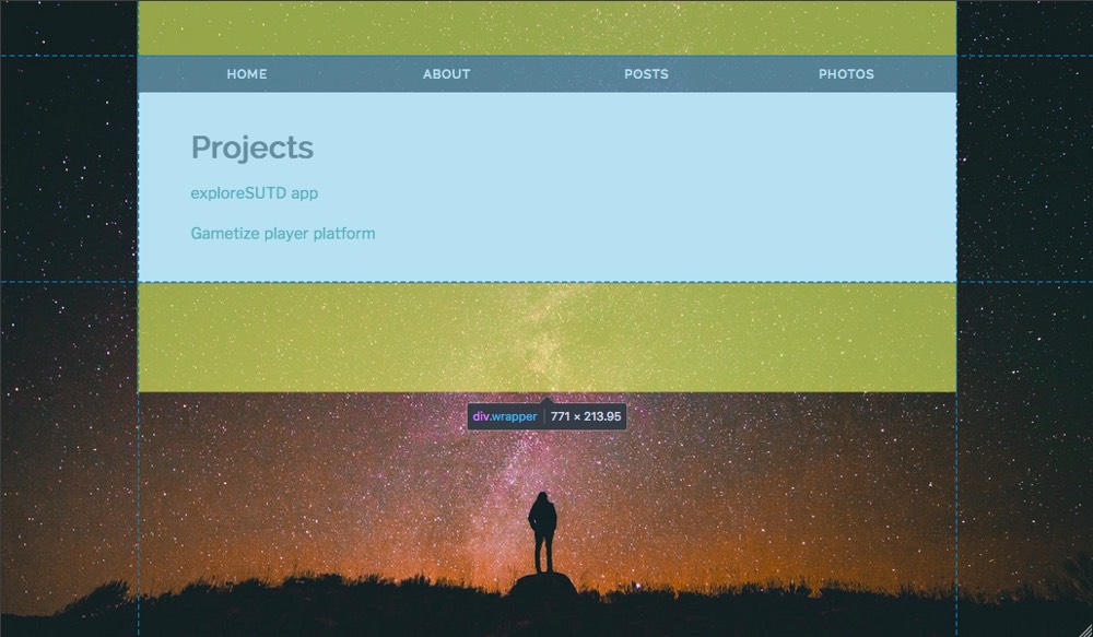
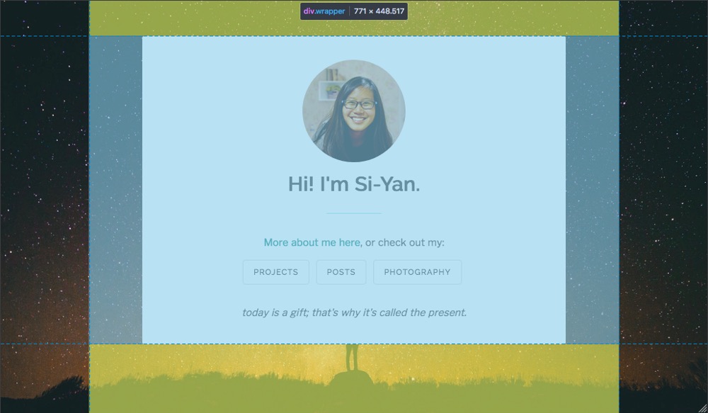
Works decently, though using margins for the vertical spacing doesn’t seem very elegant.
(Now that I look at it again, I realize I should’ve added the .home to wrapper and set its width to 60% directly, instead of modifying the width of .content-block.home. Oh well.)
Finally on to CSS grid!
Whew. So, I started off by converting the mobile layout to CSS grid. Just one column, and 4 rows (top spacing, navbar, content-block, bottom spacing).
.wrapper {
  width: 100%;
  min-height: 100%;
  display: grid;    /* CSS grid! */
  grid-template-rows: 50px min-content min-content minmax(150px, auto);
  grid-template-columns: 100%;  /* prevent the width from getting stretched by these code blocks */
  grid-template-areas:
    "."
    "n"
    "c"
    ".";
}

.content-block {
  grid-area: c;
}

.navbar {
  grid-area: n;
}
I used grid template areas to name my grid cells. Being able to visually see the layout is pretty cool! For the home page, there is no navbar so the “n” row will just collapse to zero height.
Next, bigger screens. For this, I need 3 columns (left spacing, content, right spacing). I wanted to keep the content part at 75% page width (60% for home), but also within the min and max width (400px and 960px) that I had previously.
I changed the .home class to be on the same level as .wrapper instead of with .content-block, so that all layout stuff can be done at the grid level.
  <div class="wrapper home">
    <div class="content-block">...</div>
  </div>
@media (min-width: 36em) {
  .wrapper {
    grid-template-columns: auto minmax(400px, 75%) auto;
    grid-template-areas:
    ". . ."
    ". n ."
    ". c ."
    ". . .";

    &.home {
      grid-template-columns: auto minmax(400px, 60%) auto;
    }
  }
}
You can mix different units when specifying row/column sizes, but turns out I couldn’t do all of my width requirements together. This keeps the middle column at 75%/60% page width, down to a minimum of 400px. I had to add another media query to ensure the max width:
@media (min-width: 80em) {
  .wrapper {
    grid-template-columns: auto 960px auto;

    &.home {
      grid-template-columms: auto 768px auto;
    }
  }
}
And the results:

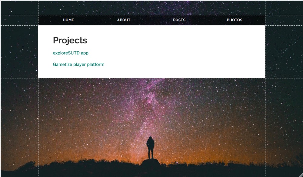
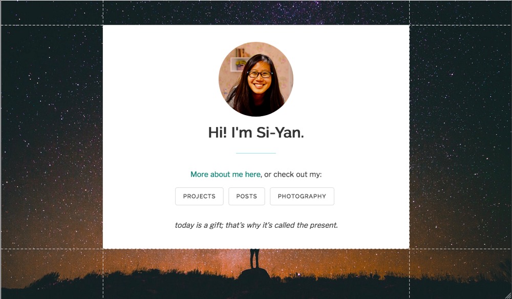
Firefox very nicely lets you see the grid lines. I managed to get the layouts consistent with my initial design across all device widths!
Thoughts
Using CSS grid for the first time was pretty interesting! It makes you think about your overall page layout and where each block fits in, rather than start from the individual blocks and try to get them to the position you want.
I really like having the layout visually understandable through grid template areas, and I think it makes it more maintainable - if I want to tweak some of the widths next time, it’ll be super easy for me to see where I should edit.
This new implementation actually made my code significantly longer, because of the grid-template-areas lines. And also because I had to add another media query for max content width on very big screens. But I think it kinda makes sense, since the max content width only applies to very big screens in the first place.
Using a grid layout lets you think, design and develop in different screen sizes independently of other sizes. One cool thing about this is that you can place your content in different orders for different screens, without worrying about how to order the HTML!
There are more features like grid gap (gutters between rows/columns) and auto rows/columns that I haven’t explored yet. But grid layout is definitely very apt for the complicated web page layouts we have today! Next step: use it for my photo gallery, and in other projects whenever appropriate.
If you want to know more, watch the video or read about CSS grid here.