Making Maps - Education as a social leveller?
28 April 2018
This term, I took Making Maps I, a really cool module on spatial analysis and data visualization in SUTD. It’s a HASS (humanities, art and social sciences) mod, which are usually all readings/ discussions/ essays, but this one had lots of hands-on labs, working with QGIS and R to produce maps and various kinds of charts!
For the final project, my team was interested in understanding the role of education as a social leveller, admist recent studies and discussion on growing class divisions and inequality in Singapore. Singapore prides itself on being a meritocratic society, and the education system is supposed to be a major social leveller. However, is it really effective, or could it in fact be contributing to inequality?
We did research and conducted a survey to gather data, then analysed it in R to produce a report.
This has been one of my most memorable projects in SUTD, because it’s a topic that’s super relevant to us. And also because exploring the data was so frustrating at times (due to being new to R), but was also very absorbing. Our survey data is a mere 21kb, but by combining it with data that we gathered from other sources, we had many different angles to explore it from.
Deciding how to visualize the data was also an interesting process. Sometimes I’d have an idea for a chart, but after really plotting it out with our data, it would end up being too cluttered to draw any conclusions, or showing a different conclusion from what I’d assumed. We learnt to refine our data visualizations, and to approach analysing data with hypotheses to be tested, rather than assumptions of what the data would show.
I’ll share the main findings here, but do check out the full report to find out more!
1. Majority of “elite” primary schools are located in some of the highest-income districts (Bukit Timah, Novena, Newton)

Using the classification from Schools and the Class Divide paper, elite primary schools are represented as orange dots on this map. Each district is coloured based on income per capita, with darker meaning higher income.
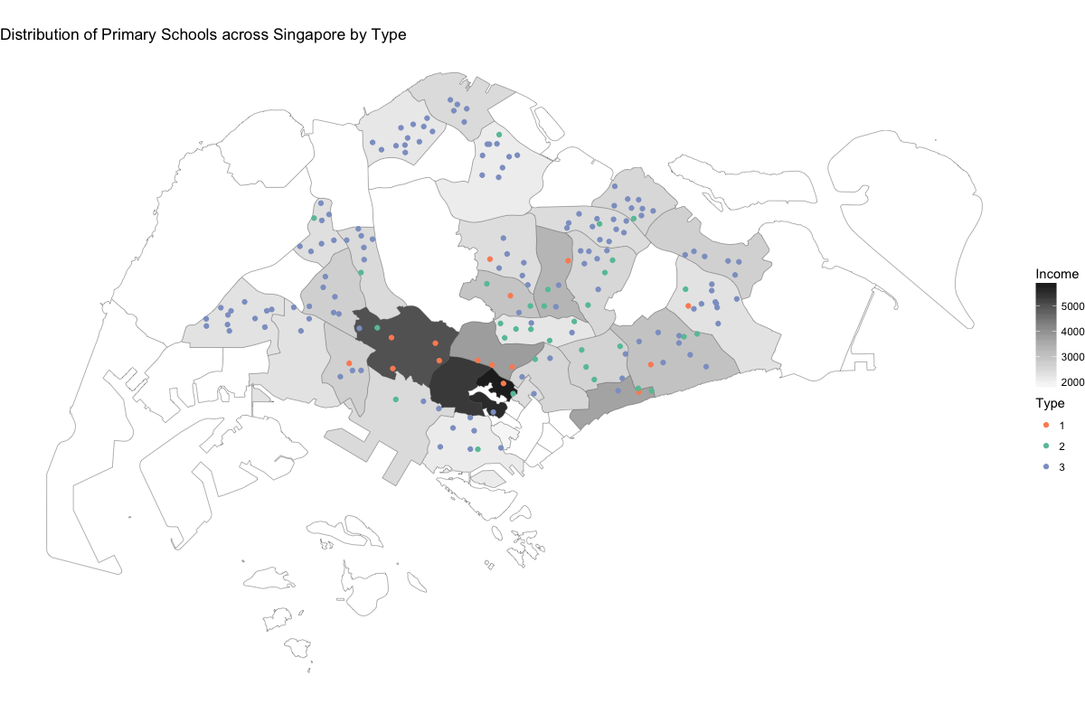
From this, we hypothesized that those who stay in these richer districts are more likely to attend the type 1 primary schools in their districts. However, we did not manage to show a direct link, because we found that students are willing to travel further away from their homes to attend type 1 schools.
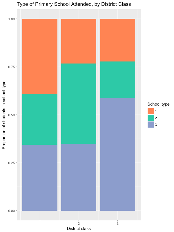
2. People staying in higher-income districts tend to go to type 1 and 2 primary schools
We ranked all districts according to their income per capita, and split them into 3 equal-sized classes. Class 1 contains the richest 1/3 of all districts (for reference, it includes Bukit Timah, Marine Parade and Bishan while class 3 includes Ang Mo Kio, Tampines and Yishun).
Here, we see a clear difference in the type of primary schools attended, across the 3 district classes.
3. Elite primary schools are hard to get into without any “connections” to the school
Primary school registration has a few different phases. In summary, people with various connections to the school (eg. sibling studying there, parent is alumni, parent volunteers in school activities) get to apply for admission first. Only in Phase 2C, the last phase, do general applications start.

We created a violin plot to see what proportion of school vacancies are already filled up before Phase 2C (ie. places filled in Phase 1 to 2B, which rely on connections to the school).
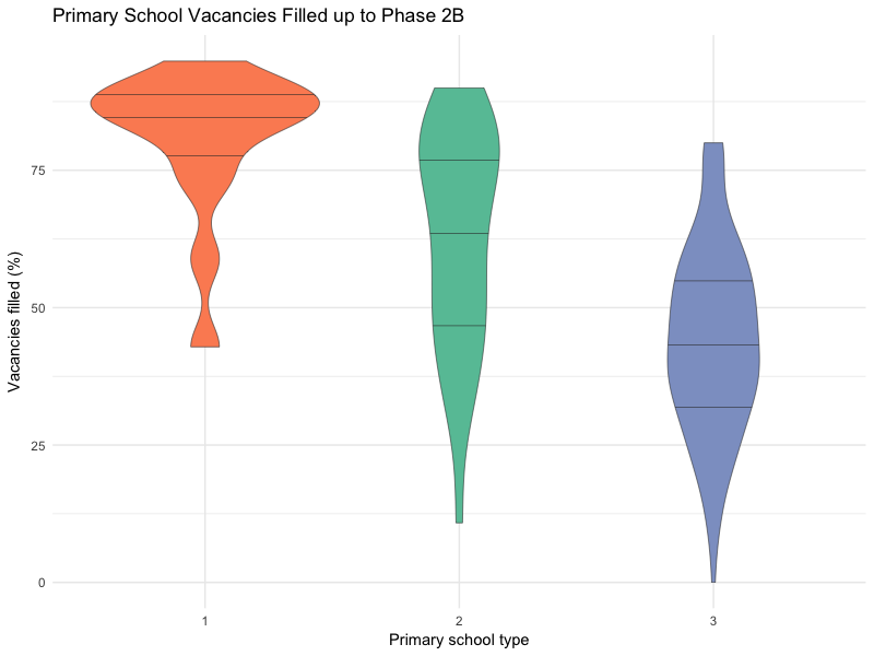
We can see from the plot that most type 1 primary schools have over 80% of their places filled before Phase 2C. This means that people with the right connections have much better chances of getting into these schools. For those who don’t, good luck trying to ballot for the remaining 20-40 places!
4. Surprisingly, PSLE aggregate scores for the different primary school types seem to be the same… or are they?
From our survey data, we matched each respondent’s primary school to its type, and created a violin plot of PSLE scores.
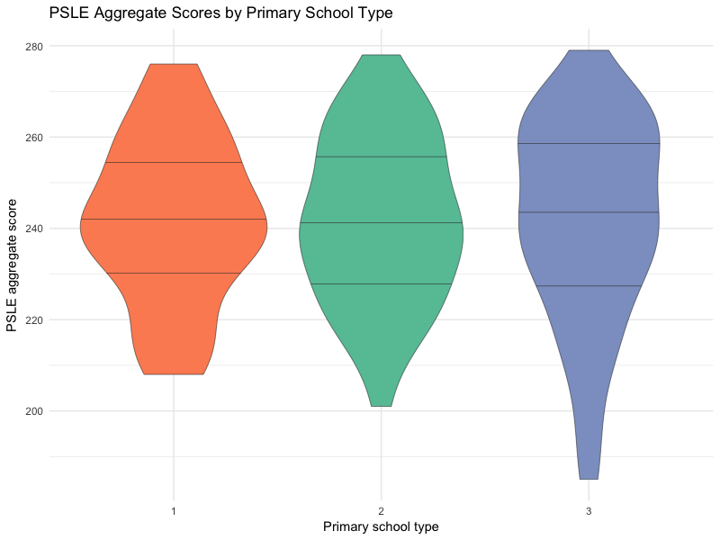
From this plot, the distribution of PSLE scores is roughly the same for each primary school type. So, it looks like the type of primary school you attend doesn’t matter! Is this really true, or is there anything else behind this?
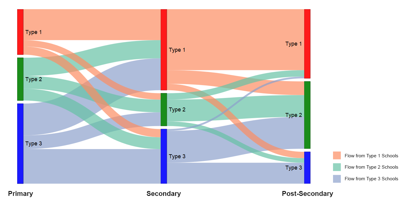
5. Those who start in type 1 primary schools tend to stay in type 1 schools throughout their education
We plotted a Sankey diagram showing the educational paths of our survey respondents:
Takeaways
From these points, we conclude that not everyone has an equal opportunity to enter an elite primary school, due to disparities in families’ wealth and connections. How does this affect inequality in Singapore, and what can be done about it? More analysis and data exploration can be found in our report.